My process consisted of four main stages. As we learned over the course of this internship, preparation and planning are key to getting anything done. Thus, my process divided itself into four parts, of which three were preparation of a sorts.
1. Learning Digital Humanities
I prepared to pick my own topic.
The first part of this project was heavily dependent on immersing myself in the DH community. Working in a seminar format (with about a three-to-one ratio of librarians and archivists to interns), we began by reading scholarly articles on digital humanities and attending a one-day NorthEast Regional Computing Program conference at UMass on Data Visualizations, as well as browsing the twitter and webpages of digital humanities hubs at places like UCLA. We met with those people working most closely with the collection (the archivist, the cataloguer, the digitizers who are creating digital versions of some of the materials) and learned the history of its purchase.
In short, we amassed the information compiled on this website in the “What is DH” section, transfixing our ultimate gaze towards Native American studies and projects.
2. Exploring Options
I prepared to gather my materials and start making them useful for a project.
Briefly, we began reading secondary source materials and formulating potential research questions. One thing we discovered in this stage was that often, a visualization does not necessarily have to have a clear purpose in mind, especially in early to middle stages of its creation. Unlike the approach to writing a research papers, the topic of a digital humanities project can be free of a hypothesis for the most part.
An important activity in this stage was what we called “sandboxing.” Sandboxing involved playing freely to assess the capabilities of tools like ViewShare, TikiToki, Google n-gram viewer, Google Fusion Tables, Omekah, Scalar, MangoMaps, StoryMapper, and many other less well-known tools for making graphs, timelines, and other presentations. We also found that many technologies out there have mixed strengths and weaknesses. It was helpful at this point to make a list of potential tools for creating potential projects, but the conclusion I ultimately came to was that “out-of-the-box” tools that are streamlined for ease of use are also fairly limited in customizable options. It often seems that having more programming or tech experience can put you in the works for a more useful and attractive project – which is not so say that those without coding experience cannot create a great project. It is wise, however, to know whom to contact with questions about feasibility, troubleshooting, whether it be a colleague, another project team member, or a particularly lively online forum.
We were asked to tie our projects in to the medium they focus on – in this case, the collection of Native American books. Criticism of digital humanities has cropped up around projects in which technology is brought to bear on a project without consideration of its subject, or without giving credit in any way to the source material. In our case, we tried to read up on current scholarly articles in humanities databases as well as new releases discussed in podcasts/articles on the New Books Network to better situate our project ideas in current Native American studies. We wanted our projects to be meaningful and useful to a current audience. As we rounded out our research, we also looked through staid but hopefully authoritative guides like the Cambridge Companion to Native American Literature and First Peoples: A Documentary Survey of American Indian History. Last on our list were tribal websites to try and see what conversations Native American people today are having online.
After much vacillation between eras in Native American literature and topics concerning passing as Native American, I chose to focus on topics that would allow me to include as many of the books as possible, to better showcase the variety of the Collection. I decided I wanted to try to map features like publication location and authors’ Native American affiliations as derived from the catalog metadata.
3. Preparation: Data extraction and clean up
I prepared to map the data.
Before dealing with easy data formats like Excel or CSV files, I first had to ask for help from some of the librarians to extract the information I wanted from the library catalog. It turns out that outputting this data into a useable format requires some massaging of the library catalog. After a successful output of many useful fields, such as title, and author, as well as genre, or geographical subject subfield, I was presented with a beautiful Excel spreadsheet from which to work.
That was only the beginning. I then proceeded to learn how to use OpenRefine, formerly Google Refine, which is a free program you can download to clean data and make it even more useful. When dealing with thousands of entries, it isn’t practical to do some things by hand that would otherwise seem trivial. For example, if some places of publication are recorded as New York, others as New York City, and a few as New York.City, these three will not be recognized as having the same publication place. It takes a sophisticated program or some programming savvy to clean data, namely standardize it and format it the way you need it. At this stage, I realized it is useful to know which programs you’d like to try out using your information set, so that you can figure out which file formats and particular conventions your program requires of the data.
I used the following sources as well as the official guide, Using OpenRefine, to figure out how to edit my catalog entries and make them useful.
http://googlerefine.blogspot.com/
http://enipedia.tudelft.nl/wiki/OpenRefine_Tutorial#Overview
http://schoolofdata.org/handbook/recipes/cleaning-data-with-refine/
4. Mapping
I made maps – at last!
I researched Native American tribal efforts to integrate mapping and spent some time considering the role of mapping and its possible encroachment on different conceptions of space, after being directed to an article reporting the dispute around maps as “formalizing authority” over peoples. Privileging Google Maps’ version of land and space, the article points out, ignores performative ideas of location tied to storytelling. After looking through other websites, like TribalGIS.com, I decided that there was sufficient support of mapping among tribal organizations that I felt I could carry out my project, with care. Though my project is not directly aiding by helping with organization and creation or maintenance of roads and buildings, it does bring attention to a part of literature that only began to receive its due after N. Scott Momaday’s 1968 publication of House Made of Dawn, sometimes thought to be the first of a “Native American literature Renaissance.” These maps and collections pay homage to the writers going back to the 1700s, which can document and historicize Native American print culture.
After considerations of static versus interactive maps, I decided to create interactive maps. My decision was based on very particular circumstances: though static maps are more reliable when loading and can reach a wider readership with different internet speeds and user abilities, interactive maps seemed to me the best way to invite users to start
exploring the books and feel some intimacy with the fact that they were independently looking at particular books’ metadata; more practically, I found that ESRI’s ArcGIS Online was licensed to Amherst College under an institutional license that allowed me to make maps on this normally-expensive web application for free.
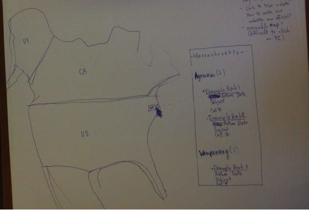
First, I sketched out by hand what I intended the map interface to look like. I hoped that this map would act as a sort of visual catalog of the Collection, but it was increasingly clear that not every book would be included. For each map, I eventually had to sacrifice inclusion of certain books that did not have details available in the catalog. Working with what I had, I was able to map the publication of 1377 of the books and affiliations for about 150 nations/groups.
Down in the weeds of ArcGIS Online, I created rough regional maps to loosely tie tribal and group affiliations with geographical areas of the United States. Though the collection includes works published outside of the United States, I decided to focus on this area. I worked with a technologist in our Academic Technology Services department to work out how best to create a regional map layer and what kinds of data available online for locations of modern day reservations. (I learned that some tribal groups are petitioning for recognition from the U.S. at this point.) Then I worked with the somewhat expansive, somewhat limited capabilities of ArcGIS Online, as well as the desktop application ArcMap, in order to plot the regions and cities of publication. Because ArcGIS online does not allow multiple entries existing in the same spot to pop up easily (for example, if 300 books were published in New York only one entry will appear when clicked), I decided to compensate by creating another layer of yellow auras around each plotted point to represent each location’s quantity of books published.
If I had more time, I would try to float names that appear when hovering over portions of the map so that local tribal and group affiliations would pop up in text form. I would also try to improve the catalog-style map’s interface so that users can more easily come to a list of books and their scanned covers when browsing. I also need to develop a clear system to deal with the matter of forced relocation and migrations, because many groups were forced into different regions of the United States during the early to mid-1800s. In this first pass, I tried to include those group affiliations in both locations, but there may be a cleaner way to do this.
Follow-up
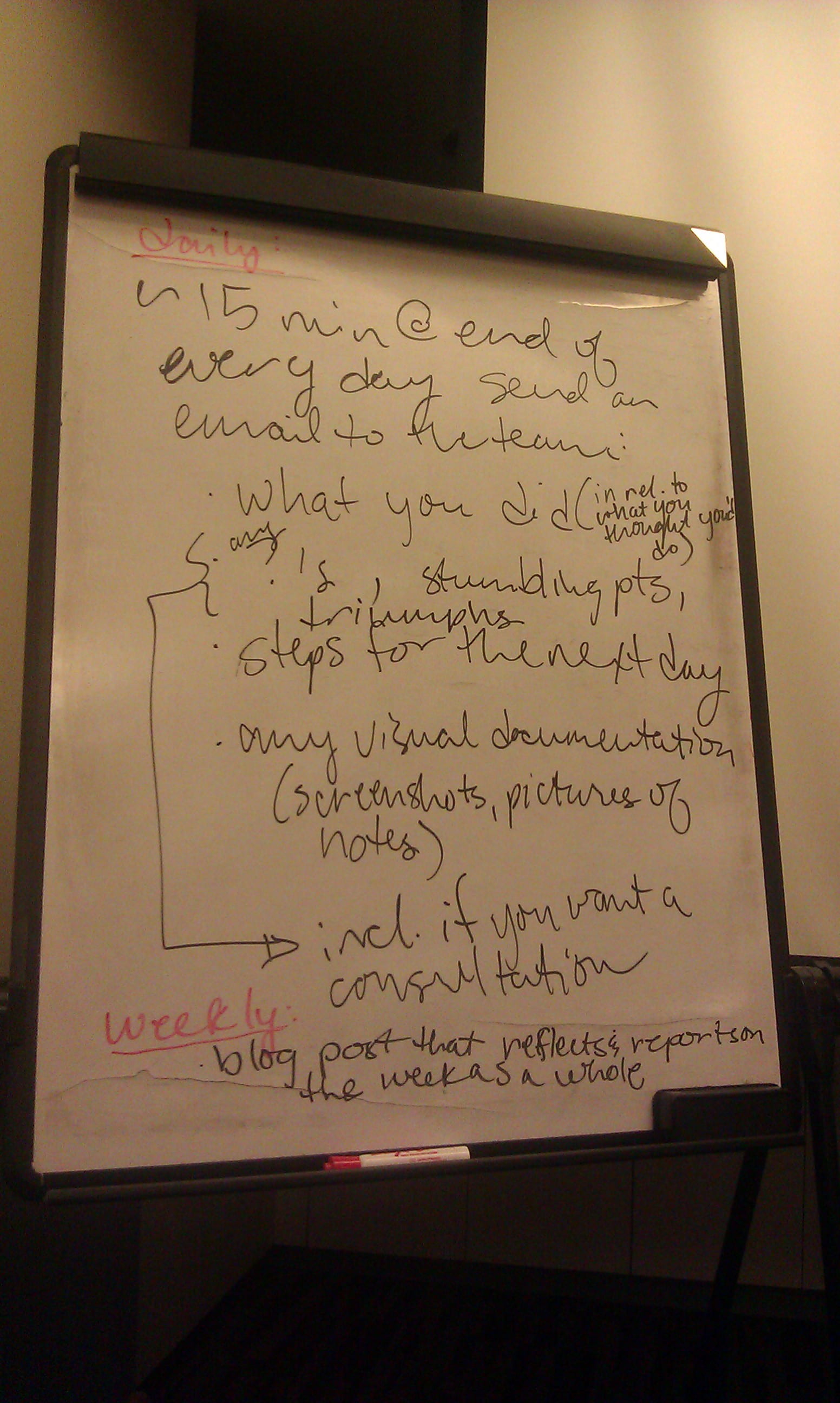
Lastly, I proceeded with the other interns to submit my website for informal user testing, in which loyal supporters of our project took the time to click every single link and proofread our written materials on the websites. Documentation relied on records that we made a habit of keeping throughout our process, first as a shared online schedule, then as blog posts, and finally as a spreadsheet that recorded each day’s goals, progress, and problems.
Future work will have to continue to expand the catalog and check its accuracy. As it stands, tribal affiliations were compiled by referencing The Cambridge Companion to Native American Literature (2005), as well as the Contemporary Authors resources of Gale Biography in Context, followed by American Indian Biographies (2005) and the Native American Authors website created by the ipl2 Consortium. Because the Amherst College library uses Library of Congress terminology, the catalog was also configured to follow that terminology list, though it should not be reflected in any maps I make if it disagrees with preferred names.
More work is also needed to discuss this kind of work in the arena of open source data. Should the metadata be available for download among the wider public, to foster openness and encourage independent projects? Is it less useful to spend the time extracting the data when it won’t be used often? Should data only be released if it has been cleaned, so that mistakes are not traced back to nonstandardized data? These are all important questions as well.
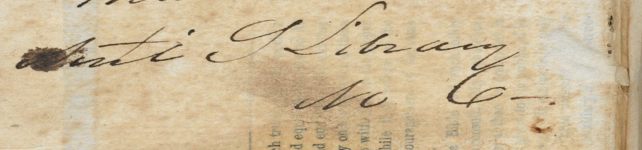
Image source: Lewis, R. B. Light and Truth: From Ancient and Sacred History. Portland [Me.]: D.C. Colesworthy, 1836. Frontispiece.